Spring colors for interior rooms can completely shift the mood of your space, and if you’re considering interior house painting in Avon, CT, this is the season to refresh those walls. The longer days and softer light bring out the best in color, making it easier to choose the perfect shade. Whether you’re tackling one room or updating the whole house, a fresh spring palette can do wonders.
As an interior house painter working across Greater Western Connecticut Region, I’ve helped countless families create inviting, comfortable homes through smart paint choices. Spring tends to be the most exciting time for color updates. Clients often ask what colors look best on spring walls, and my answer is always the same: it depends on the light, the layout, and your personal style—but I’ve got a few tried-and-true favorites that look great across the board.
Key Takeaways
Interior Painting in Spring? Here’s Why the Timing Is Spot On
Avon might not be the warmest spot on the map year-round, but spring is a sweet spot for interior house painting. Temperatures hover in the comfort zone, windows can be cracked open, and you’re not dealing with humidity or the harsh winter chill.
One of my clients off West Avon Road planned her nursery paint job for late March. She loved how the soft color she chose—Windmill Wings—looked better in spring sunlight than it ever did under winter’s gloom. That room still stands out as one of my favorites.
5 Stylish Spring Colors for Interior House Painting
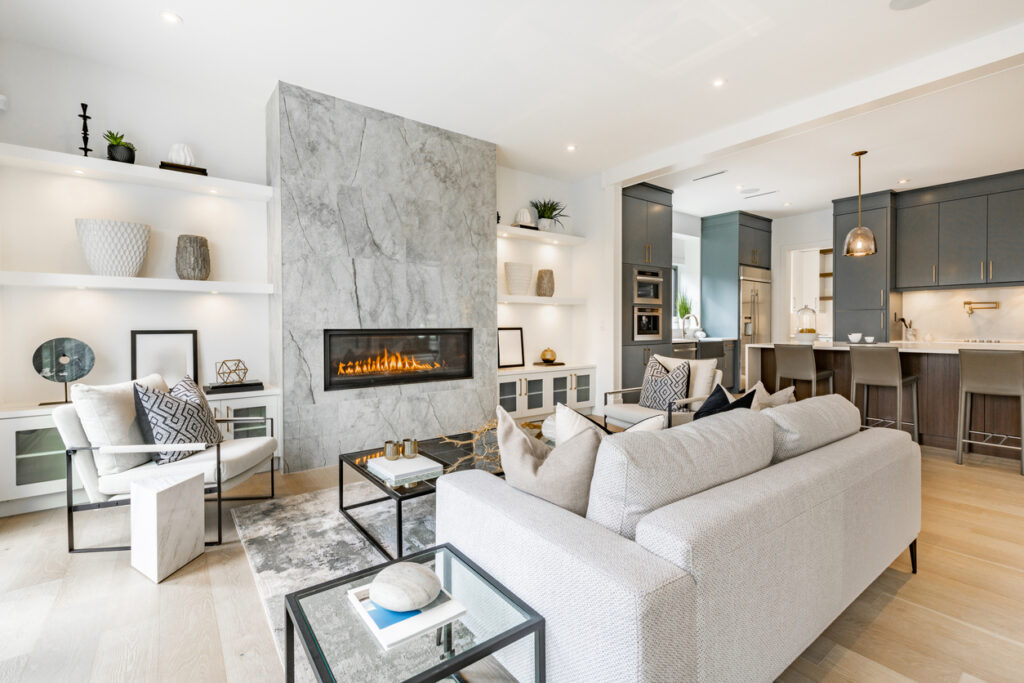
Simply White OC-117 – Bright but Not Harsh
Simply White is one of those shades that never feels out of place. It brings a clean, timeless feel while adding just enough warmth to avoid that “blank canvas” look.
In an Avon colonial, we painted the entire upstairs hallway in Simply White, using a satin finish on the trim and eggshell on the walls. It gave the home a more cohesive, updated look without clashing with the existing hardwood floors and wainscoting.
This white isn’t cold—it’s soft, approachable, and works everywhere.

Weston Flax HC-5 – A Sunny Yellow That Feels Familiar
For homeowners who want color without going bold, Weston Flax is a cheerful yellow that works especially well in kitchens and mudrooms. It reminds me of sunshine through linen curtains—subtle, warm, and never overpowering.
We recently used it in a kitchen renovation in Avon Woods, where the family wanted something uplifting to balance their gray-toned floors. It instantly brought new life to the space.
It’s a great option for brightening up high-traffic areas without overwhelming them.

Windmill Wings 2067-60 – Soft Blue with Personality
If you want a color that stands out without being loud, Windmill Wings is worth a look. It’s got just enough blue and purple to feel whimsical without going into pastel territory. I used this in a powder room on Talcott Notch Road and it was a hit—the room felt cozy, modern, and interesting.
Pair it with crisp white trim, natural wood, or silver fixtures. It works in guest rooms, bathrooms, or creative spaces where you want a little character.
It’s playful, but still grown-up—great for spring house painting.

White Down OC-131 – The Neutral That Anchors Any Room
White Down is one of those underrated neutrals that fits just about anywhere. It has a creamy tone that keeps things from feeling flat, especially in rooms with minimal decor or architectural detail.
We used this in a ranch-style home near Thompson Brook, and it pulled the open layout together beautifully. The client had a mix of modern and traditional furniture, and this shade worked across every space.
When you want something clean that still feels lived-in, White Down delivers.

Stokes Forest Green 2035-40 – Add Some Mood Without Going Too Dark
Spring doesn’t always mean pastel. If you want contrast, Stokes Forest Green brings depth to a room while still being earthy and balanced. I’ve used this in home offices, living room accent walls, and even in mudrooms with great results.
One client paired it with gold fixtures and oak cabinetry—it turned their workspace into a cozy retreat.
If you want to give your spring house painting some boldness, this is a solid choice.

Choosing the Right Colors for Spring Interiors
Picking the right spring colors for interior walls is all about how they behave in the light. In Connecticut, spring brings a mix of cloudy mornings and sun-filled afternoons. That can change how color looks dramatically.
Place a few large swatches on different walls and observe how they change throughout the day. A color that feels soft at noon might read as too cool in the evening. Take the guesswork out by living with your samples before making a final call.
Also—don’t ignore sheen. A matte finish absorbs light and hides flaws, while satin or eggshell adds just a touch of glow. The right combination makes all the difference.
Why a Local Painter Makes the Whole Process Easier
Hiring a local interior house painter in Avon means you’re working with someone who understands the quirks of modern homes—like how paint behaves in rooms with dormers, skylights, or narrow hallways.
At If Walls Could Talk, we take the guesswork out of color selection. We help you see what works best for your lighting, your layout, and your style. And we’ll always clean up behind ourselves, keep your space protected, and finish on schedule.
We make interior painting feel easy, not disruptive.
Ready to Start Your Spring Paint Project? We’re Here to Help
Spring is the ideal time to explore new shades, and the five spring colors for interior projects we’ve shared can completely change how your space feels. Whether you’re after something airy, cozy, or bold, a fresh coat of paint makes a big impact.
If you’re in Avon, Simsbury, or Canton, give If Walls Could Talk a call at 860-530-2744 to schedule your FREE estimate today.
New season. Fresh walls. Let’s bring your home to life.